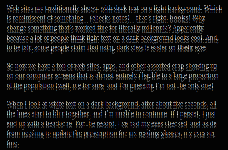
Web sites are traditionally shown with dark text on a light background. Which is reminiscent of something… (checks notes)… that’s right, books! Why change something that’s worked fine for literally millennia? Apparently because a lot of people think light text on a dark background looks cool. And, to be fair, some people claim that using dark view is easier on their eyes.
So now we have a ton of web sites, apps, and other assorted crap showing up on our computer screens that is almost entirely illegible to a large proportion of the population (well, me for sure, and I’m guessing I’m not the only one).
When I look at white text on a dark background, after about five seconds, all the lines start to blur together (see image above), and I’m unable to continue. If I persist, I just end up with a headache. For the record, I’ve had my eyes checked, and aside from needing to update the prescription for my reading glasses, my eyes are fine.
Here are a few links to web sites that default to dark mode:
- The Exa website
- Entreprenal
- The Official Mastodon documentation site
- https://elronnd.net/writ/2021-02-13_att-asm.html
A request to web designers and developers: if you can’t resist making your web site dark mode by default, please, please at least provide some method for viewing it in light mode.
Some browsers have built-in features that allow viewing dark sites in light mode. But they’re inconsistent. Firefox has Reader View, which reformats a web page to show it like a book, with less clutter and — more importantly — dark text on a light background. Sadly, the Reader View button, which normally appears at the right end of the address bar, doesn’t always show up. That’s apparently because it’s only able to handle individual posts/articles, not other types of pages.
There are many Firefox plugins for showing web pages in dark mode, but initially I wasn’t able to find one that does the opposite. I had been struggling with a plugin called Dark Reader, which sort of worked, but only with a lot of fiddling, presumably because it was designed to do the opposite of what I want.
Recently, however, I discovered a Firefox plugin called Tranquility Reader. This one does exactly what I want, forcing page text to black and page background to white. So far, it’s worked perfectly on every page I’ve tried.
When installed in Firefox, Tranquility Reader adds an icon to Firefox’s toolbar. Click it once to view the current page as black text on a white background. Click it again to go back to the page’s default colour scheme. Simple!
If you ever find yourself struggling to read dark mode web pages, try Firefox with Tranquility Reader. It may save you from a headache or two.
Related:
 boot13